
🌳🌳How (un)healthy are NYC trees? 🏙
data: 2015 NYC Street Tree Census
techniques: geospatial analysis, big data, logistic regression, random forest
Healthy NYC Trees

How can we use the Street Tree Census Data to more efficiently plan for the long term health of the urban forest? As part of TreesCount! 2015 on the National Day of Civic Hacking (06/04/16), NYC Parks has engaged with voluntreers, tree-oriented community groups, and non-profit partners to identify how street tree census data can help improve equitable care of our urban forest.
There were several themes to this hackathon and I chose to focus on two:
How can we use Street Tree Census Data to better engage with and target the efforts of community stewardship volunteers to improve the health of the urban forest?
Trees in urban settings face many challenges from both people and the environment. Tree stewardship by the community is an essential part of achieving urban forestry goals. Resources for tree care are finite, and so it is important that we better understand tree stewards and the challenges they face, and maximize the effectiveness of our volunteers by supporting their stewardship activity.
My goal was to explore Street Tree Census data to help understand who collects the most data, where stewardship efforts are most needed and what is the influence of seasonality on volunteer engagement. Turns out, even though the majority of data was collected by professional staff, a big chunk of it we have thanks to volunteers. By visual inspection of the distribution of data entries across boroughs we can see an interesting pattern emerge:
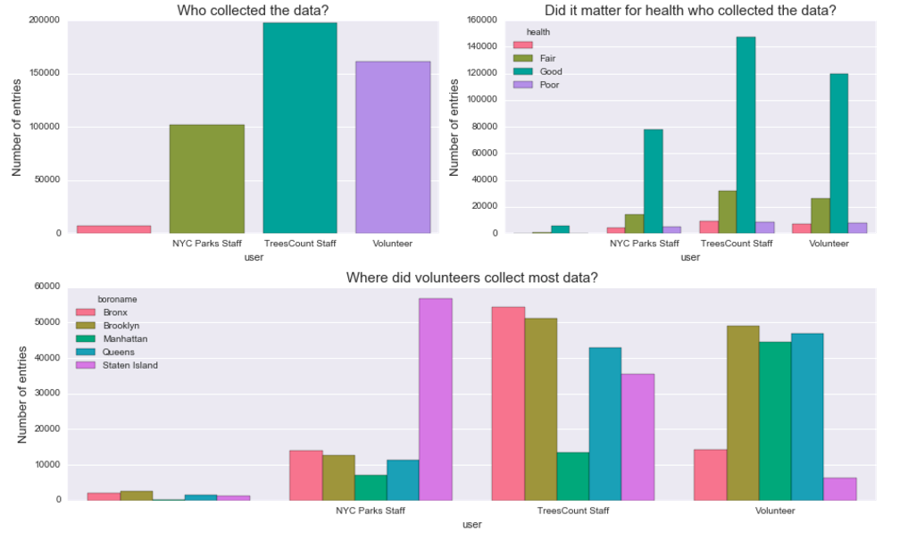
Insights: Looks like Manhattan, Brooklyn and Queens were favored by volunteer teams, with NYC Parks staff & TressCount staff leading the collection in the other boroughs. This came as a big surprise to me - in three out of five boroughs volunteers contributed between 45000 and 50000 entries! In Manhattan the difference is particurarly striking, volunteers entered approximately twice as many samples into the system as staff members. By contrast, in Bronx and Staten Island it was largely by staff efforts that we have a detailed map of the trees.
I suspected that if we look at the map it will be the farthest neighborhoods from Manhattan that were traversed by the staff. Mapping our data would also allow to quickly look at another variable which plays a role for volunteer programs: seasonality. For civic engagement time of the year definitely matters. For example, if a non-profit is planning an outdoor program, they will most likely avoid doing it in winter. Was it the case with the TreesCount! initiative?
How did the data collection evolve over time?
Are there any seasonal trends? Having data from just one year we can’t use any reliable quantitative methods, such as ARIMA, so our observations are purely speculative.
The map below represents data entries within five boroughs recorded by three groups: staff (NYC Parks & TreesCount, in different shades of blue) and volunteers (green). Missing entries are plotted in grey. You can play around by changing the date of the records in the lower left corner when you access the map on my Carto profile.
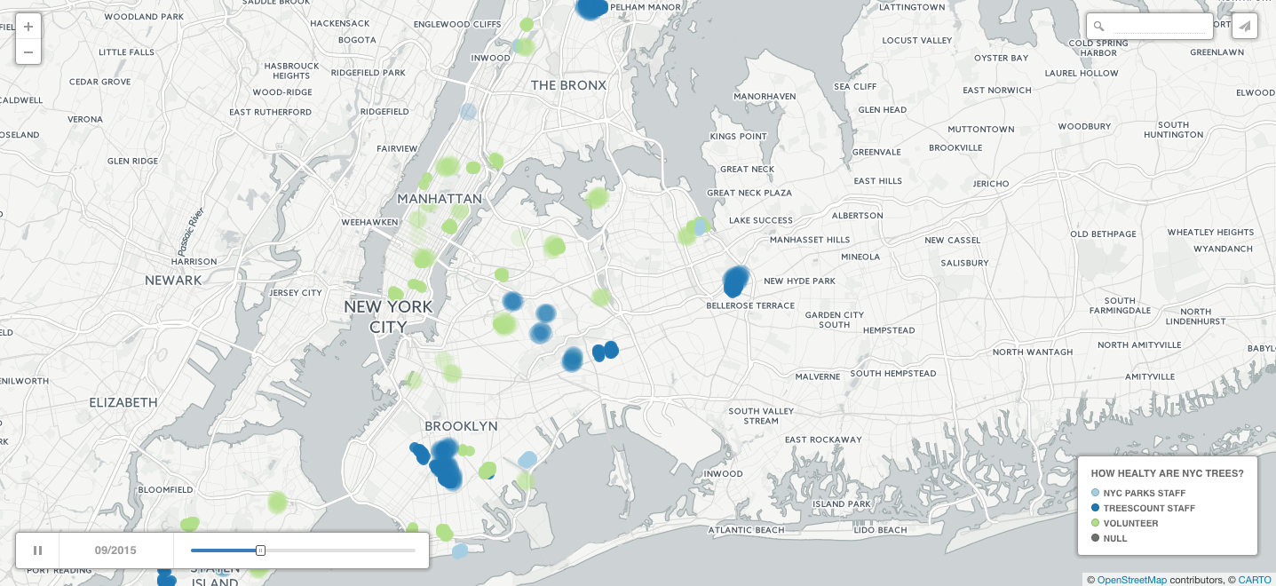
Source: To play with the map, click here
How can we use the Street Tree Census Data to more efficiently plan for the long term health and growth of the urban forest?
With the 1995 and 2005 street tree censuses, NYC Parks has been able to catalyze major advances in urban forest management, making science-based operational decisions and quantify the benefits of the urban forest. The coverage of the data is awesome:
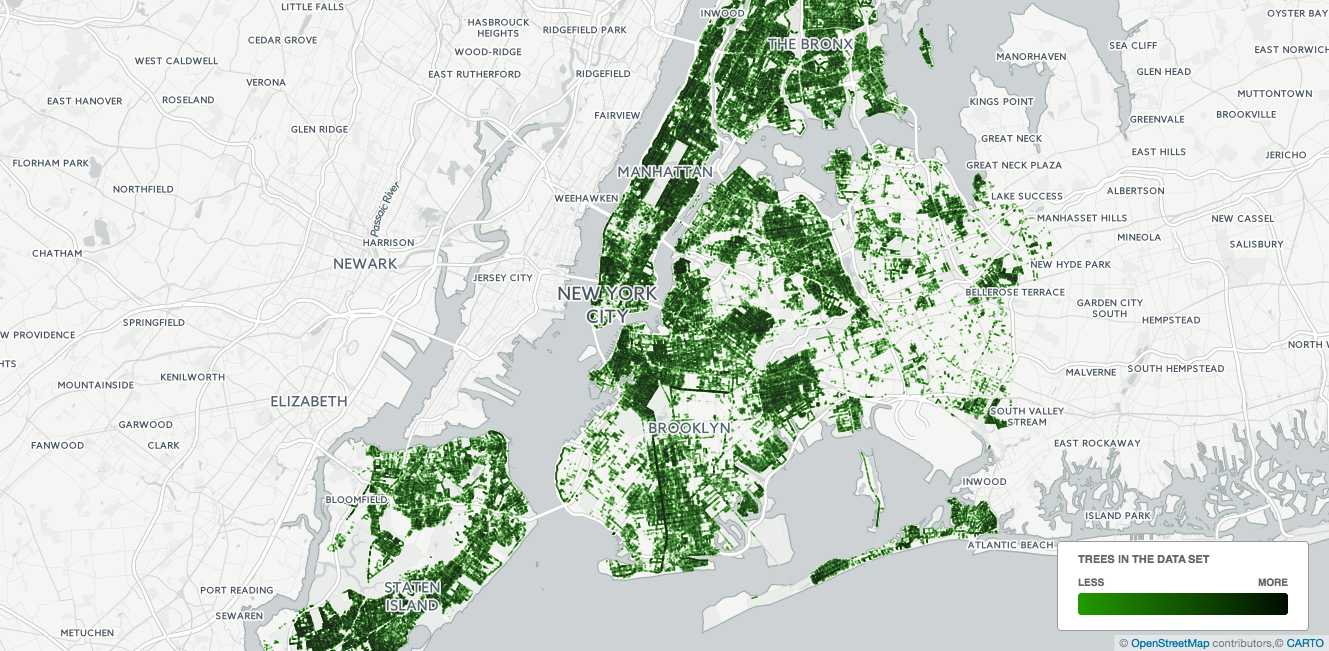
Source: My Carto profile
Looks like we have a solid coverage across the city, with clear gaps where parks* (e.g. Central Park) or airports are - which is a good sanity check. For now, I’m not looking at the density of the trees in the city, just checking if there are any obvious flaws to the dataset.
Key indicators of poor health
Is there a relationship between species and health? Let’s look at a plot of simple counts of trees within each specie that were categorized as “healthy” and those that were described as being in “poor” health.
In the first pass I will use just a subset of features choosing the ones that look like most likely candidates to influence trees health, such as trunk diameter, health status, location and species.
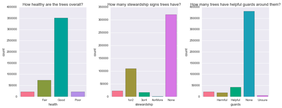
Is there a relationship between stewardship signs and health or between guards and health?
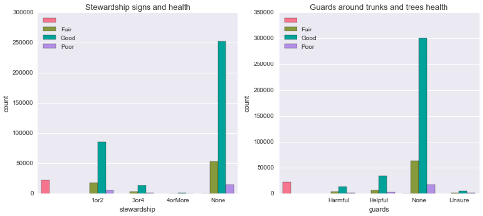
Doesn’t seem like it. Just from visual inspection seems like, proportionally, there are more healthy than in “poor condition” trees among those that have no guards whatsoever compared to those that do have (helpful or harmful). How about trees’ diameter? Does it look like there is a difference on any of the above features depending on trees’ diameter?
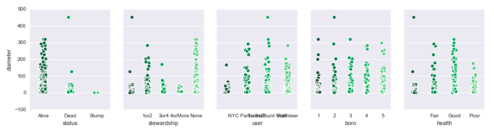
Insights: Well, who would have guessed? Dead trees have a smaller diameter than alive ones! Hah, but there could be something in there - it could mean, for example, that freshly planted trees which have a small diameter are in highest risk. This makes more sense when we look at the rightmost figure - it turns out that trees labeled in “good” health have also higher diameter. This relationship is further explored with the logistic regression and random forest models (you can read more about them in the python notebook).
What about different species? Are some of them more likely to be at health risk?
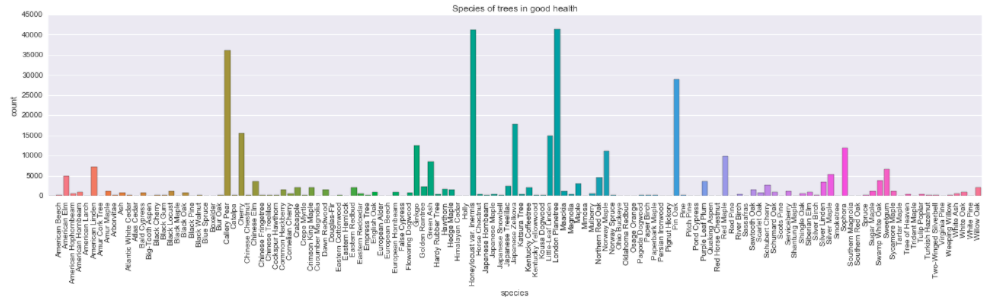
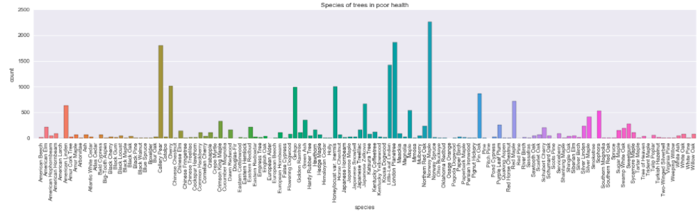
Insights: Visual inspection suggests there aren’t striking differences between distribution of trees labeled as “healthy” versus “in fair health” (compare second and third plots), however there are some species that seem to be more prone to fall into the unhealthy category. For example, Cherry, Ginkgo or Little Leaf Linden’s bars seem to be higher in the third compared to second plot. This might be simply because it’s easier to notice the difference in species that are common in the data set (and are subsequently represented with higher bars) or that other species are less likely to be labeled as unhealthy.
Classification of unhealthy trees with machine learning methods
Logistic function is often used in social and life sciences to describe phenomena with binary outcomes (“no tumor / tumor present”). I used it in my research to describe how well we remember objects in visual space. There is nothing magical about it, in fact, you could also use cumulative normal, Cauchy, Gumbel or Weibull (they differ slightly when it comes to asymptotes and other parameters). Basically, it can be described as:
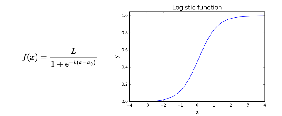
Where k is the slope of the function (how steep it is) and x0 is the point where the y value is exactly 0.5 (sometimes called threshold). Threshold is an important indicator for determining bias in your data - for instance, if in the situation pictured above we add another curve where x = 2 when y = 0 it means that the whole function is shifted to the right but the dynamics of the phenomenon is essentially the same. If this second curve has a different k (or the slope) it means that the dynamics is different - the funcion asymptotes at y = 1 faster or slower which has important implications for the interpretation of your results.
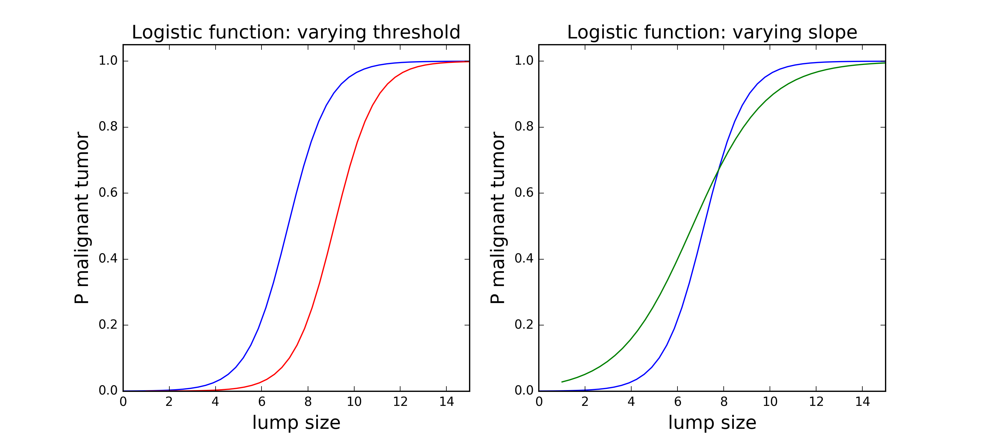
Following the tumor example, lets say that the x axis is the size of tissue cluster and y the probability that it is a malignant tumor. Then, if they have a different threshold but the same slope the two curves could represent two different cell types which typically have different sizes (therefore, are shifted on the x axis) but follow a similar process when growing into a tumor (by the way, I have no idea about cancer, this is a made up example). If, however, they have different slope but the same threshold it means that for one cell type (with steeper slope) the probability of being a malignant tumor increases faster with size.
In classification tasks the threshold is the boundary of decision: that’s the point above which we decide that this is a tumor and below we say it’s just a lump of cells. In this analysis, I used logistic function to classify trees as “healthy” or “unhealthy” based on a set of parameters such as species, neighborhood, stewardship signs, presence of metal guards around the trunk and who collected the data.
The most important features that increase the odds of that the tree will get “unhealthy” label:
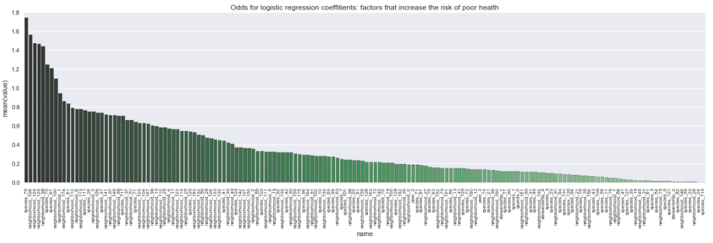
The font is small, but the top ones are species: 79, neighborhood: 108, 124, 125 and 98. For a similar plot which shows the odds that the tree will get “healthy” label. In short, the top ones are species 44, and neighborhoods 81, 95, 73 and 58.
Let’s look at the confusion matrix to assess the performance of the model. It gives us information about hits (true positives), false alarms (false positives), misses (false negatives) and correct rejections (true negatives). This distinction comes from signal detection theory - if we imagine two overlapping distributions, e.g. with healthy and unhealthy trees sitting on an axis with, for simplicity, continous variable like trunk size, we could determine where each of the components of the confusion matrix comes from by applying a criterion threshold:
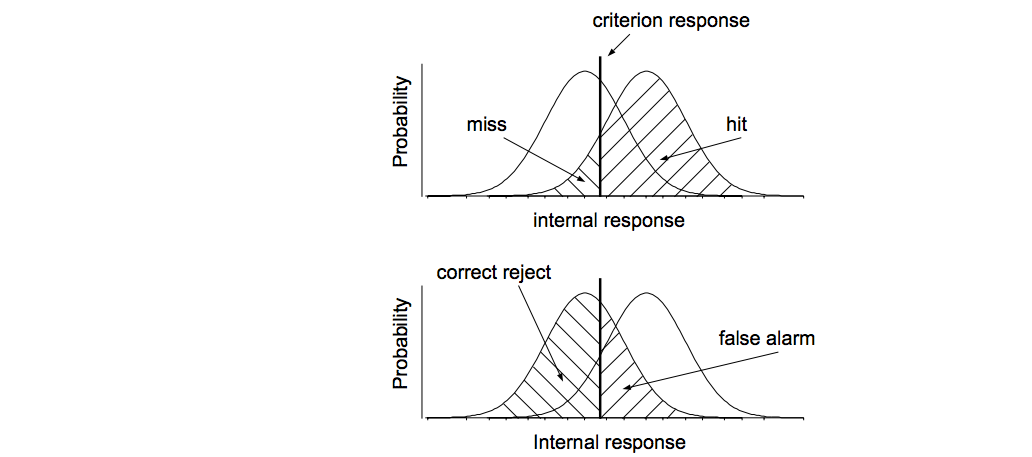
Source: David Heeger’s notes about Signal Detection Theory
Additional readings about logistic and psychometric function:
- As always, I recommend reviewing Andrew Ng’s ML lectures on logistic regression
- Classic, beautiful and thorough paper by Wichmann and Hill on fitting, sampling and goodness of fit of psychometric function.
- Amazing, very well written introductory textbook to psychophysics along with code and examples by Kingdom and Prins. Worth recommending is also their Matlab and Octave toolbox Palamedes for fitting psychophysical data using MLA or Bayesian methods.
Data 🌳😀
The dataset is available here, feel free to play with it yourself, it’s very well documented.